

The CSS Box Model
In CSS, the term "box model" is used when talking about design and layout.
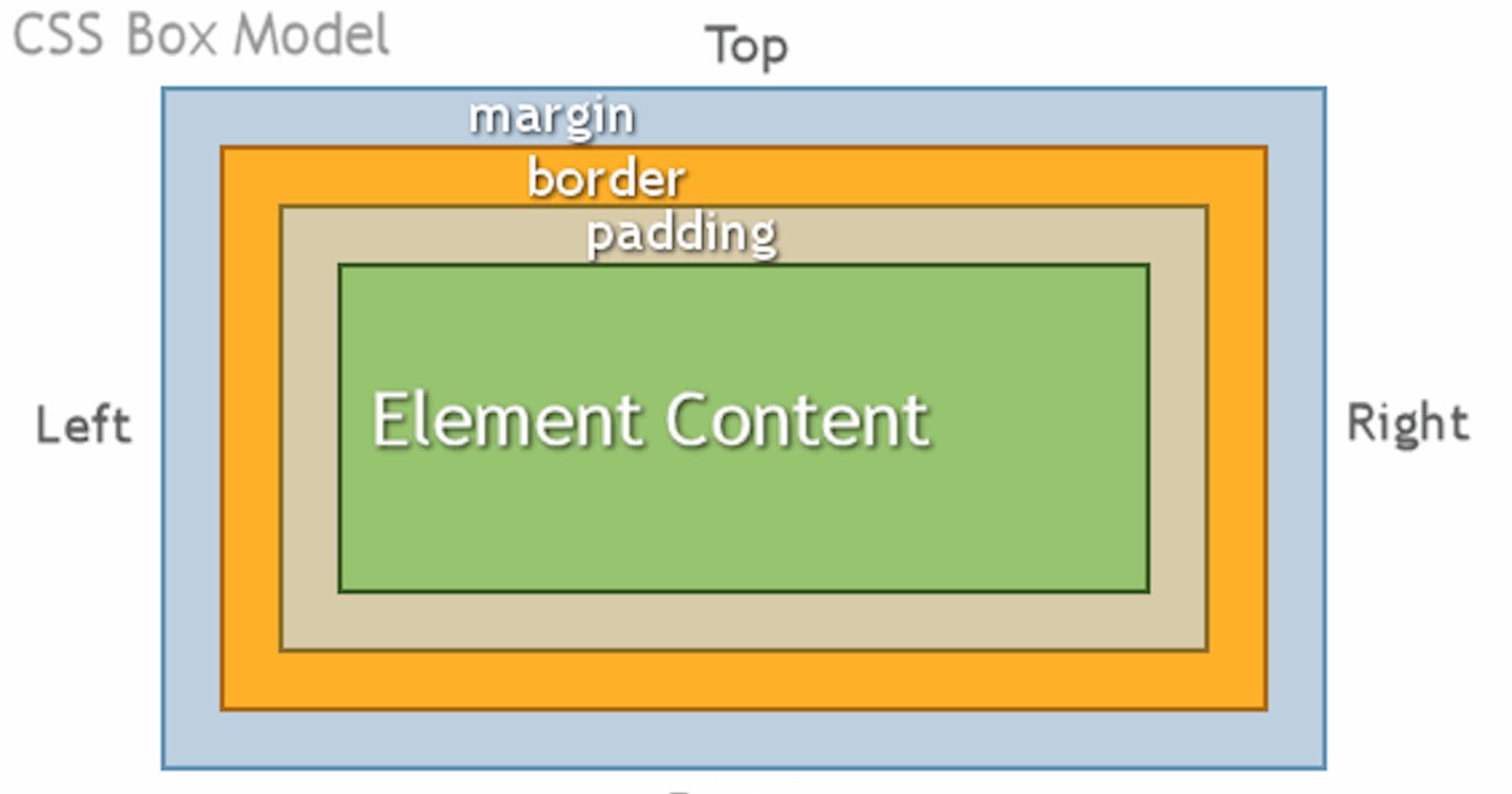
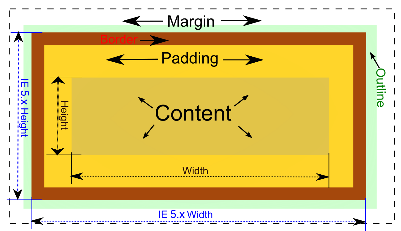
The CSS box model is essentially a box that wraps around every HTML element. It consists of: margins, borders, padding, the actual content and height and width. The image below illustrates the box model:
Explanation of the different parts:
The Margin
On the CSS Box Model, the margin is the section in the exterior. This edge extends around the box model taking the empty space between the margin and border properties. You can consider this a buffer area that separates the interior of the CSS box model from other HTML elements on a page.
Note that the margin is defined by both the width and height of the box, as well as set margin properties. This can also be affected by the “box-sizing” property.
The Border
Next, you have the Border property of the CSS Box Model. Keeping in the theme of separation, this area exists as a boundary between the margin and padding properties of the box. This area can be manipulated using the CSS Border property for styling and sizing needs.
The Padding
The padding section of the CSS Box Model sits in the space between the HTML content and the border. As with much of the other items in the box mode, the padding can be altered through its related properties. For example, the padding can be changed through the directions of the top, right, bottom, and left sections.
For example, we can take this sample CSS code below;
div {
  border-style: solid;
 border-color: blue;
  }
This div does not have padding defined, as such, you have the output shown in the image below.
Now, the same code is used but a padding value of 40 pixels has been added.
div {
padding: 40px;
border-style: solid;
border-color: blue;
  }
This will now alter the padding to give you the following image.
It’s easy to see that the added padding between the div content and the border has changed considerably.
The Content
The Content is the center of the “tootsie pop,” so to say. This is the main HTML content you are working to display on the site. This can range from an image, a paragraph, or even a web button. While this is quite direct in definition, it should be noted that “content” can be empty space as well. Using an empty div for example can be a neat way to add extra creative components to a site design.
The Height and Width
The properties for height and width on the box model are set through the calculations of the applied contents. However, these can also be specified directly as needed to fit the page design.
- Important: When you set the width and height properties of an element with CSS, you just set the width and height of the content area. To calculate the full size of an element, you must also add padding, borders and margins.
Example This
div {
  width: 320px;
  padding: 10px;
  border: 5px solid gray;
  margin: 0;
}
Here is the calculation: 320px (width)
- 20px (left + right padding)
- 10px (left + right border)
- 0px (left + right margin) = 350px The total width of an element should be calculated like this:
Total element width = width + left padding + right padding + left border + right border + left margin + right margin
The total height of an element should be calculated like this:
Total element height = height + top padding + bottom padding + top border + bottom border + top margin + bottom margin
EXAMPLE:
- HTML element;(content)
<html>
  <head>
    <title> Example</title>
  </head>
  <body>
      <h1> This is Me; JEWEL</h1>
  </body>
</html>
- Box Model Demonstration; (if dealing with an internal CSS)
<html>
  <head>
    <title> Example</title>
    <style>
       h1 {
        margin: 50px;
        border: 40px;
        padding: 20px;
        width: 80%;
        height: 150px
}
    </style>
  </head>
  <body>
      <h1> This is Me; JEWEL</h1>
  </body>
</html>